The arrival of good weather means spring cleaning. Now is the time to take the opportunity to redecorate your interior in the colors of the season. More than pigments, colors are above all ideas, concepts. The two unmissable ones for 2017: feminist pink and Greenery green. In a small touch or as a total look, these natural colors bring freshness to your daily life.

Greenery green, the Pantone color 2017
After Rose Quartz and Serenity Blue, Greenery green was voted the color of the year 2017 by Pantone. For the brand, this symbolic color represents “a color snapshot of what we see happening in our global culture.” Some see it as an ecological claim or a need to display the color of hope in these times of crisis... It is above all a nod to nature, we bring the outside inside.
In Feng-Shui, green is the color of renewal and life. Recalling the regenerating power of chlorophyll, it seems to rejuvenate our interior. It is attributed with soothing and rebalancing powers. For its soothing properties, it is particularly recommended in children's rooms. Babies are even instinctively attracted to this color...
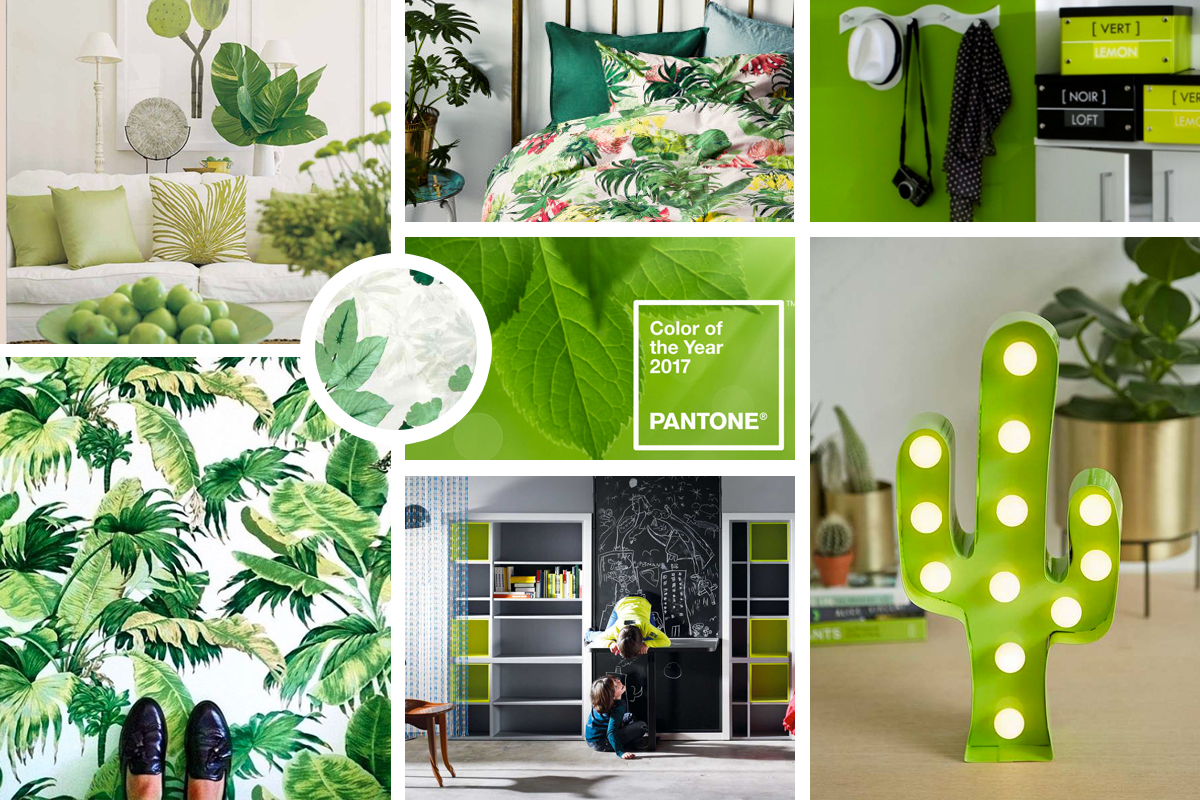 Vert Greenery: Mood notebook
Did you know ? By tradition since the Middle Ages, actors refuse to wear this color on stage. The verdigris pigment, or Paris green, used at the time released arsenic!
Multiple possible applications
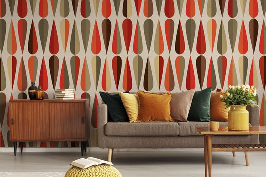
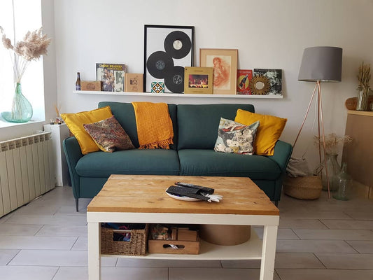
Between lime and apple green, it is a soft and dynamic color which brings a touch of very vegetal freshness. It can be combined with neutral, bright, deep, pastel, metallic shades... almost the entire color palette! Bringing out moldings and other reliefs, it awakens both old and contemporary furniture. You can even apply the total nature look by mixing wooden, green and plant elements without it seeming overloaded. You might as well let yourself be inspired by nature, sustainable and good for your health.
For the record... Nature made its comeback to the city in the 19th century. Following the two industrial revolutions, the lack of greenery was felt for the first time. It was Victorian England which set the example by building green spaces, green paths... closely followed by Europeans and Americans.
Revalorized by our contemporary societies, green has gradually become the color of health, nature, organic and ecological ideology. Green light to save the planet!
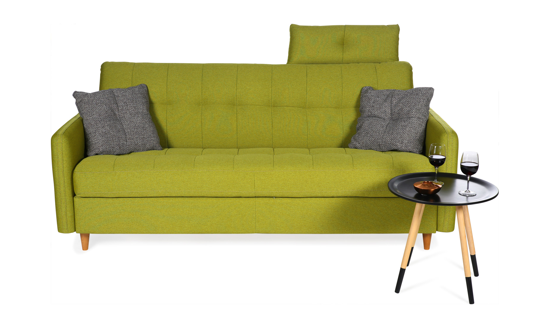
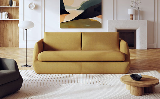
Extend the entry of nature into your home by integrating Feng Shui around your sofa and in the heart of your interior...
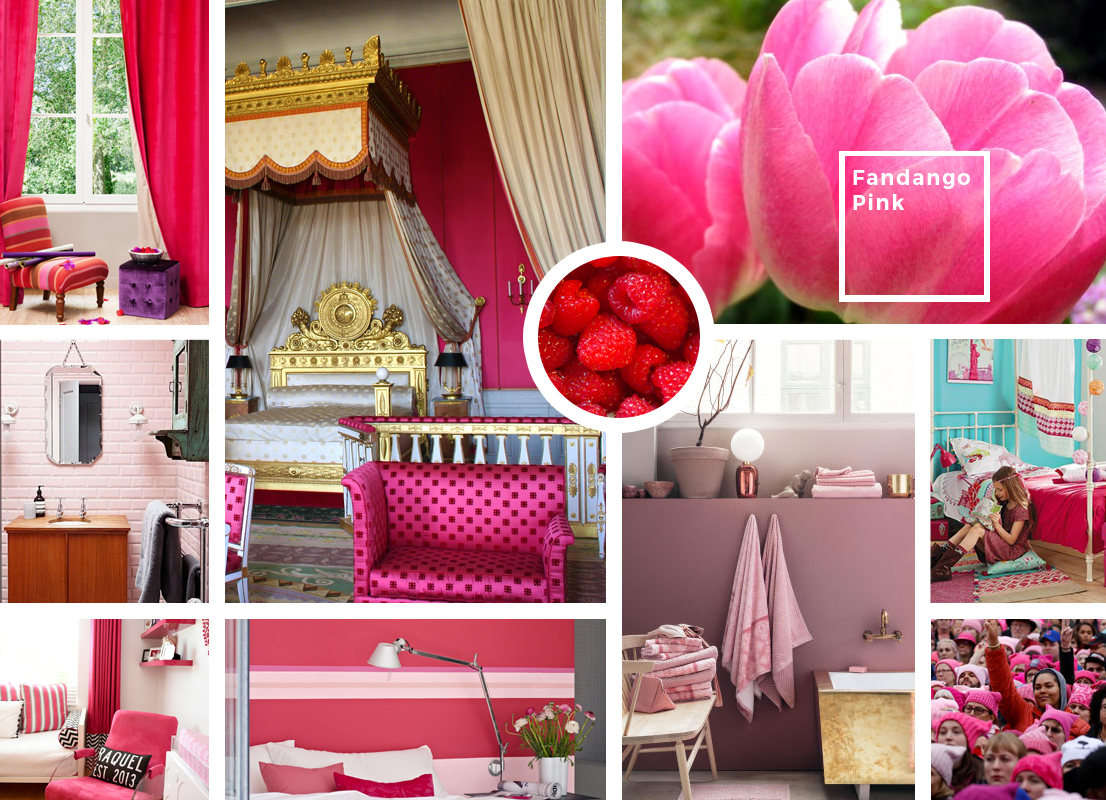
We see life in pink!
Barbie's favorite color is no longer just for "girly" girls. Soothing and stimulating, it resurfaces and settles into our daily lives for good.
Associated with femininity, sensitivity, compassion and love, it is a soothing, tender and stimulating color. In Western culture, pink represents gratitude, innocence, admiration and gentleness. Yes, girls are born in roses, boys, in cabbages!
Today, the codes have changed, the color is accepted. Pink even became a banner on January 21, 2017. The day after the inauguration of the American president, a large women's march took place, following the sexist remarks of Donald Trump. A sea of feminists wearing their “Pussy Hats,” a pink cap with cat ears, had invaded Washington that morning.
The impact of pink on a daily basis
In the 1980s, psychologists had prison cells painted pink. As a result, aggressive prisoners became calmer. Many bus companies that repainted their seats pink saw a reduction in vandalism, and charities whose workers wore pink shirts received three times as many donations...
 From powder pink to engagement
Do you remember fashion designer Elsa Schiaparelli, Coco Chanel's main rival and especially her signature color "Schiaparelli pink"? Better known as “shocking rose”, the color appeared for the first time on its “Shocking” perfume in 1936, before being taken up by the greatest fashion and design creators. Between fuchsia and magenta, Schiaparelli described it as "all the light and all the fish in the world gathered together".
For the record... Pink, a French tradition.... Until the 18th century, pink was not considered a “true color”. It was Madame de Pompadour who brought it, then wore it and imposed it on the French court.
What possible variations?
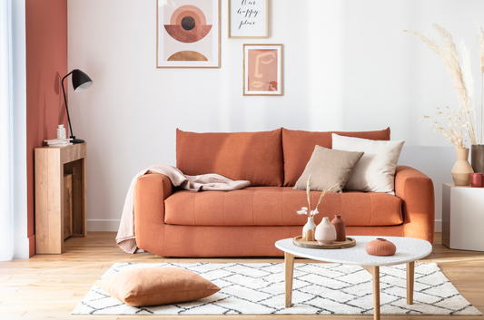
Close to the Fandango Pink shade from Pantone, we love combining this bright color with contrasting colors like anthracite gray, greenery green, duck blue and yellow, very present this year. Combined with black and gold, pink brings a chic side to a living room. For those who would like a more subtle touch of pink, its pastel version from 2016 remains relevant.
You will have understood, the trend this year is for natural and emblematic colors... So do you see life in pink or in Greenery?
To go further, discover how to decorate your interior to the rhythm of the seasons

 The up and down coffee table: practical on a daily basis for small homes
 Liftable table: which design to go with my sofa?
 Liftable coffee table: round or rectangular? Our advices
 Cleaning laminated or melamine furniture
 Bad smell in furniture: 10 tips to know
 Comment nettoyer un canapé en velours côtelé : guide complet et conseils pratiques


